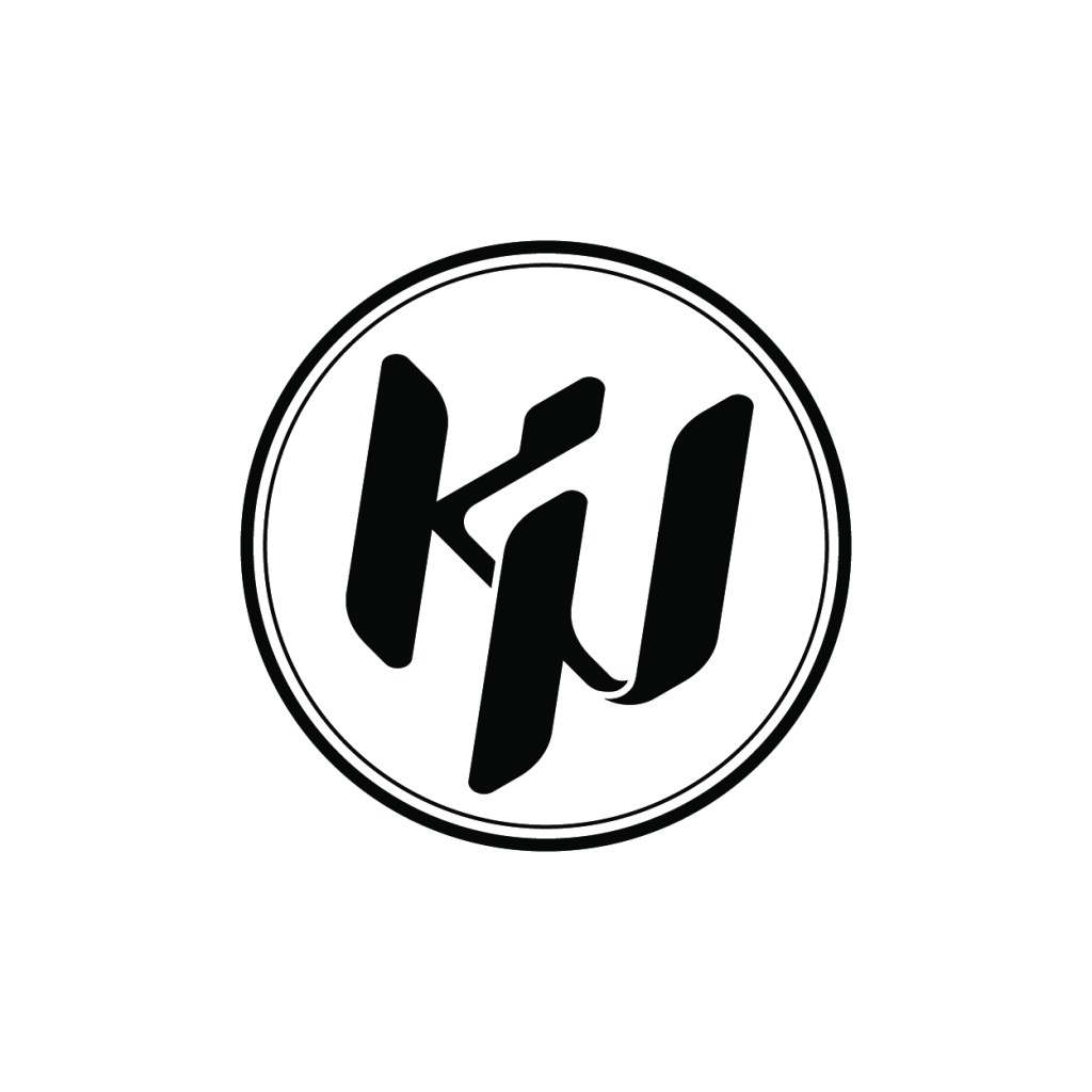
Having a personal logo was something I’ve always been interested in, and I finally got around to designing it! I’ve been thinking about reviving some of my old social media accounts to post projects there, so this logo would be the perfect thumbnail for my profiles. This may evolve over time, but I’m quite happy with it for now.
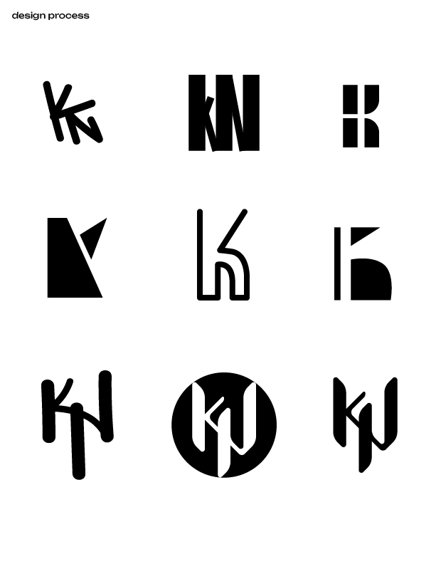


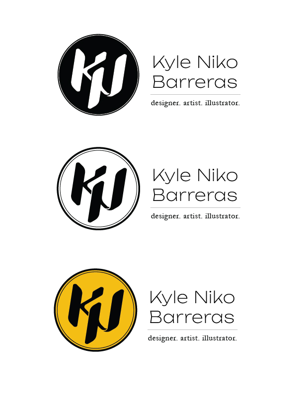

The design of my logo is comprised of the letter K and N. Short for Kyle Niko. I wanted to integrate these two letters seamlessly, while keeping a sense of order and fluidity. After a series of iterations of different ideas, I developed the version which had strong vertical forms that connected with diagonal lines. I found that the diagonal leg of the K could swoop down and become the diagonal for the N. Discovering that idea was my ah-ha moment during this project. What’s even cooler, is that the negative space between the K and N reads as a B! Can you see it?

Leave a comment